Components interfaces
Components interfaces
Components usually define interfaces to let ther instances save settings.
A quick example is the interface of the button component to let you specify the button label and the action to be fired or page to view once tapped:
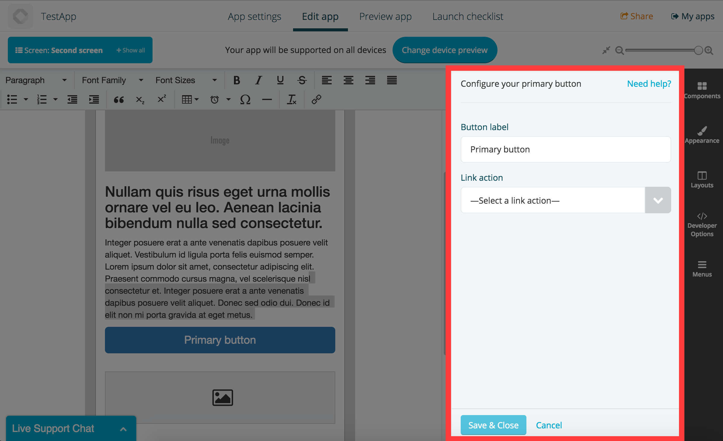
In the above example, the button component is also using the link provider to select an action for the button.
Both page components and app components can have an interface, although it is not required.
The template (interface.html)
The interface consists in a html template which gets parsed and compiled via Handlebars, plus any other asset (like CSS and JS files, though they don’t get compiled).
Your template will get available in the view all settings that have been previously saved in the instance as handlebars variables. You can also print the component unique id using the {{ id }} variable.
Example:
Saving the settings
Saving an instance settings is done using the public method Fliplet.Widget.save found in the fliplet-core package:
// Returns a promise
Fliplet.Widget.save({
  foo: 'bar',
  url: 'funny-cats.mp4',
  hello: {
    world: true
  }
});
Reading previously saved settings
Your component interface can be reopened if the component output is clicked via the screen preview by the Fliplet Studio user. Once the interface is reopened, you’re responsible for reading the previously saved settings and repopulate your interface.
Data for the interface can be retrieved using the Fliplet.Widget.getData method from fliplet-core as follows:
var data = Fliplet.Widget.getData();

// data.foo is 'bar'
UI design
Although it isn’t required, we recommend using our design patterns and styles when developing components. We have made a nice package called fliplet-studio-ui which contains most of the styles we use on our interfaces.
Here’s a sample of the interface for the button component:
Referencing assets on interface.html
Including providers
Components can include other components (if marked as providers) to add more functionalities or gather data from different sources.
Output of components
Once you’re familiar with the above documentation on the component interface, have a read to the next section which covers the output of components.