Custom templates for components
Custom templates for components
For apps using the new drag and drop system
Apps created on or after January 9th 2020 use a new improved drag and drop system based on containers which also greatly improves the experience when using the developer tools to code custom templates for components.
This is how components are shown in the developer tools:
<fl-button cid="123"></fl-button>
To customize a component template, you can simply type HTML code in the tag:
<fl-button cid="123">
  <p>This is my custom template for a button</p>
</fl-button>
You can also refer to any instance attribute of such component by using the handlebars syntax as follows:
Note: as soon as you hit the save button the HTML tag will change from the specific component (e.g. fl-button) to fl-component to symbolize that you’re creating a custom component. If you need to revert the custom component to its default template, just remove any HTML it contains and press the save button.
For legacy apps
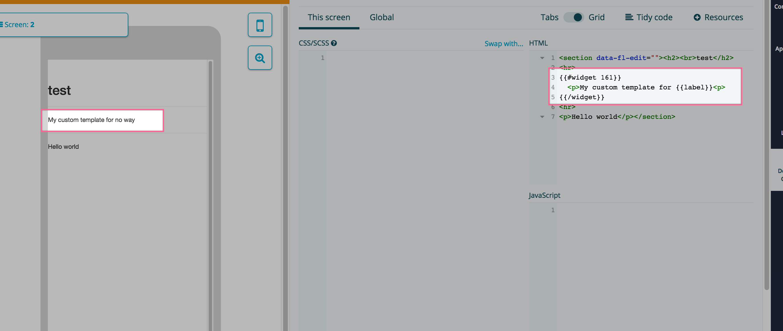
Fliplet components are usually rendered into an app screen with the {{{ widget 123 }}} syntax, where 123 would be the ID of the component.
If you need to customize how a component look — and CSS itself is not enough — you can customize the component template by changing the widget declaration tag to a handlebars block by prefixing the widget word with a hashtag and also add a closure tag. You also must use only two curly brackets to enclose the tags instead of three:
Let’s make a hands-on example customizing a primary button. First, let’s take a look at its default output on the open source github repository:
As you can see, the widget declares a {{id}} and {{label}} that we must use to keep the component behaviour. We could then customize this widget instance html as follows:
Note: data-primary-button-id="{{id}}" is required by the primary button javascript code to make the link work. Each widget might have different ways of attaching events and handlers based on dom classes, nodes or attributes.
Nested widgets
Given you have two or more widgets on the screen:
You can put one into the other by simply writing a custom block for the first and adding the second widget into it:
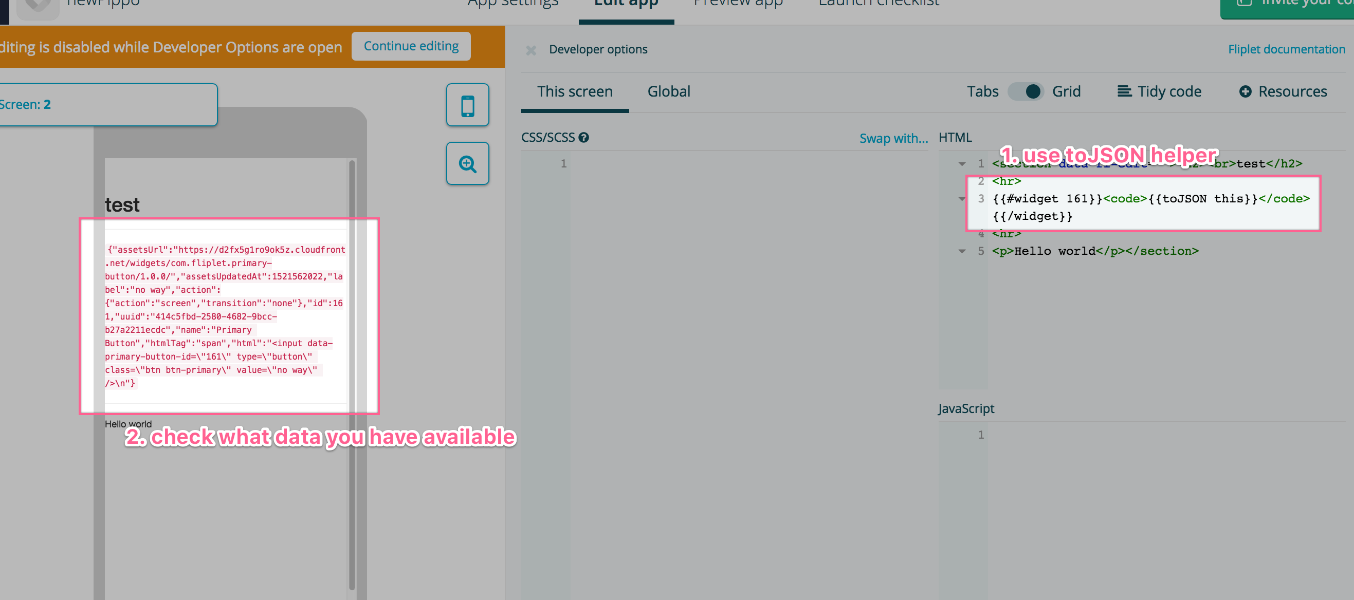
Inspect what data is available in the template
There’s a handy handlebars helper to print out the content of an object as JSON:
This is useful to find out what settings you have available in a component when creating the custom template