UI guidelines for component settings (interface)
UI guidelines for component settings (interface)
Recommended Bootstrap-based styles for buttons, forms, and typography in a Fliplet component’s Studio settings interface.
Basic styles
In the settings of our components we use the following basic styles:
Primary color: #00abd2
Secondary color: #aaaaaa
Text: #333333
Headings:
<h2><small>Heading</small></h2>
Helper text class: .text-helper
Buttons
We use Bootstrap’s button classes but we tweak the styles to make them look our own.
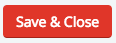
Primary button

Primary button classes: .btn.btn-primary
Secondary button
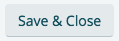
Secondary button classes: .btn.btn-default
Danger button
Danger button classes: .btn.btn-danger
Link text button

Link text button classes: .btn.btn-link
Component’s header
We always start with a small header for the component that is always visible at the top. Here is an example:
<header>
  <p>Configure your Primary button</p>
  <a id="help_tip" href="#">Need help?</a>
</header>
Component’s form fields
In our components we use the following form fields:
Input field
As we use Bootstrap, this is how our input fields markup with a label look like:
<div class="form-group clearfix">
  <div class="col-sm-4 control-label">
    <label for="input_field">Input label</label>
  </div>
  <div class="col-sm-8">
    <input type="text" name="input_field" class="form-control" id="input_field" placeholder="Placeholder" value=""/>
  </div>
</div>
If you want to use an input field without a label, all you need to do is remove the label <div> and your markup should look like this:
<div class="form-group clearfix">
  <div class="col-sm-8">
    <input type="text" name="input_field" class="form-control" id="input_field" placeholder="Placeholder" value=""/>
  </div>
</div>
Color picker
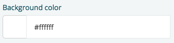
For color pickers we use Bootstrap’s input field with an addon. Here is an example:
<div class="form-group">
<div class="col-sm-4 control-label">
<label>Pick a color</label>
</div>
<div class="col-sm-8">
<div class="input-group">
<div class="input-group-addon" style="background-color:#00abd2"> </div>
<input type="text" class="form-control" value="#00abd2">
</div>
</div>
</div>
If you want to use an input field without a label, all you need to do is remove the label <div> and your markup should look like this:
<div class="form-group clearfix">
<div class="col-sm-8">
<div class="input-group">
<div class="input-group-addon" style="background-color:#00abd2"> </div>
<input type="text" class="form-control" value="#00abd2">
</div>
</div>
</div>
Dropdown list
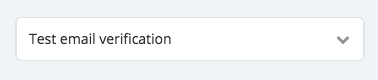
If you want to add styled <select> dropdowns that follow Fliplet’s UI styles, use the following markup:
<label for="drop-down" class="select-proxy-display">
  <select id="drop-down" class="hidden-select form-control">
    <option value="">-- Select an option</option>
    <option value="1">Option 1</option>
    <option value="2">Option 2</option>
  </select>
  <span class="icon fa fa-chevron-down"></span>
</label>
Dynamically appending options
If you are using one of these dropdowns with dynamic data to create the dropdown <option> options, start with the <select> element disabled and a single <option>-- Please wait...</option> element.
<label for="drop-down" class="select-proxy-display">
  <select id="drop-down" data-label="select" class="hidden-select form-control" disabled>
    <option>-- Please wait...</option>
  </select>
  <span class="icon fa fa-chevron-down"></span>
</label>
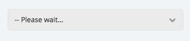
After the dynamic <option> options are added, remove the disabled attribute.
Here is an example where we append the column names of a Data Source:
Fliplet.DataSources.getById(dataSourceId).then(function (dataSource) {
  var options = [];
  var $dropdown = $('#drop-down');

  // Populate dropdown with options
  options.push('<option value="">-- Select a column</option>');
  dataSource.columns.forEach(function (c) {
    options.push('<option value="' + c + '">' + c + '</option>');
  });
  $dropdown.html(options.join(''));

  // Removes disabled attribute to allow the user to use the drop-down
  $dropdown.prop('disabled', false);

  // When loading the saved data
  if (data.columnName) {
    $dropdown.val(data.columnName);
  }
});
Radio buttons
For radio buttons we have two different styles depending on what we want to achieve.
- If you want to achieve a list of more than 3 options that might also have sub-settings under each option - You should use the more traditional style.
- If you want to achieve a toggle look with 3 or less options - you should use a button like style.
Traditional style
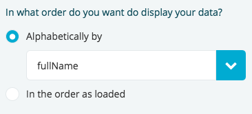
Here is the markup to achieve the traditional style with our branding:
<div class="form-group clearfix">
  <div class="col-sm-4 control-label">
    <label>In what order do you want do display your data?</label>
  </div>
  <div class="col-sm-8">
    <div class="radio radio-icon">
      <input type="radio" id="alphabetical" name="is_alphabetical" value="true" checked>
      <label for="alphabetical">
        <span class="check"><i class="fa fa-circle"></i></span> Alphabetically
      </label>
    </div>
    <div class="radio radio-icon">
      <input type="radio" id="order" name="is_alphabetical" value="false">
      <label for="order">
        <span class="check"><i class="fa fa-circle"></i></span> In the order as loaded
      </label>
    </div>
  </div>
</div>
Button like style
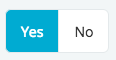
Here is the markup to achieve the button like style with our branding:
<div class="form-group clearfix inline-radio">
  <div class="col-sm-4 control-label">
    <label for="swipe-to-save">Enable this awesome option?</label>
  </div>
  <div class="col-sm-8">
    <div class="radio-buttons clearfix">
      <div class="radio radio-icon">
        <input type="radio" id="enable-yes" name="enable_option" value="show">
        <label for="enable-yes">Yes</label>
      </div>
      <div class="radio radio-icon">
        <input type="radio" id="enable-no" name="enable_option" value="no-show">
        <label for="enable-no">No</label>
      </div>
    </div>
  </div>
</div>
In both cases we hide the radio input field and we style the label to look like what we want. The trick is again to use the <label> for attribute to trigger the radio input.
Checkboxes
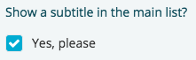
Here is the markup to achieve the checkboxes with our branding:
<div class="form-group clearfix">
  <div class="col-sm-4 control-label">
    <label for="show_subtitle">Show a subtitle in the main list?</label>
  </div>
  <div class="col-sm-8">
    <div class="checkbox checkbox-icon">
      <input type="checkbox" id="show_subtitle">
      <label for="show_subtitle">
        <span class="check"><i class="fa fa-check"></i></span> Yes, please
      </label>
    </div>
  </div>
</div>
We hide the checkbox input field and we style the label to look like what we want. The trick is again to use the <label> for attribute to trigger the checkbox input.
Tabs
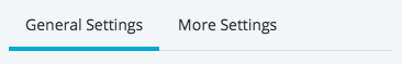
If you need to categorize your component’s settings then you should use our tabbed system. Again, we use Bootstrap’s tabbed system and we style it to look like we want it.
Here is a quick example of the markup:
<ul class="nav nav-tabs" role="tablist">
  <li role="presentation" class="active" id="general-settings"><a href="#settings-tab" aria-controls="general-settings" role="tab" data-toggle="tab">General Settings</a></li>
  <li role="presentation" class="" id="more-settings"><a href="#more-settings-tab" aria-controls="more-settings" role="tab" data-toggle="tab">More Settings</a></li>
</ul>

<div class="tab-content">
  <div role="tabpanel" class="tab-pane active" id="settings-tab">
    <!-- Content here -->
  </div>
  <div role="tabpanel" class="tab-pane" id="more-settings-tab">
    <!-- Content here -->
  </div>
</div>
Loading animation
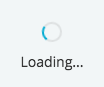
If you need to use a loading animation in you component’s output here is how you can achieve it:
<!-- Hidden loading animation -->
<div class="spinner-holder">
  <div class="spinner-overlay">Loading...</div>
  <p>Loading...</p>
</div>
<!-- Show loading animation -->
<div class="spinner-holder animated">
  <div class="spinner-overlay">Loading...</div>
  <p>Loading...</p>
</div>
Launch a help video
If you have a help video that how to use the component you can launch the video in Fliplet’s video tutorials overlay by adding the following:
$('.help').on('click', function () {
  Fliplet.Studio.emit('open-help-video', {
    code: 'm2f2VWGfqSQ' // The code in a video URL after the query '?v=' - https://www.youtube.com/watch?v=m2f2VWGfqSQ
  });
});